Beyond my own experience
Understand what makes parking the worst.
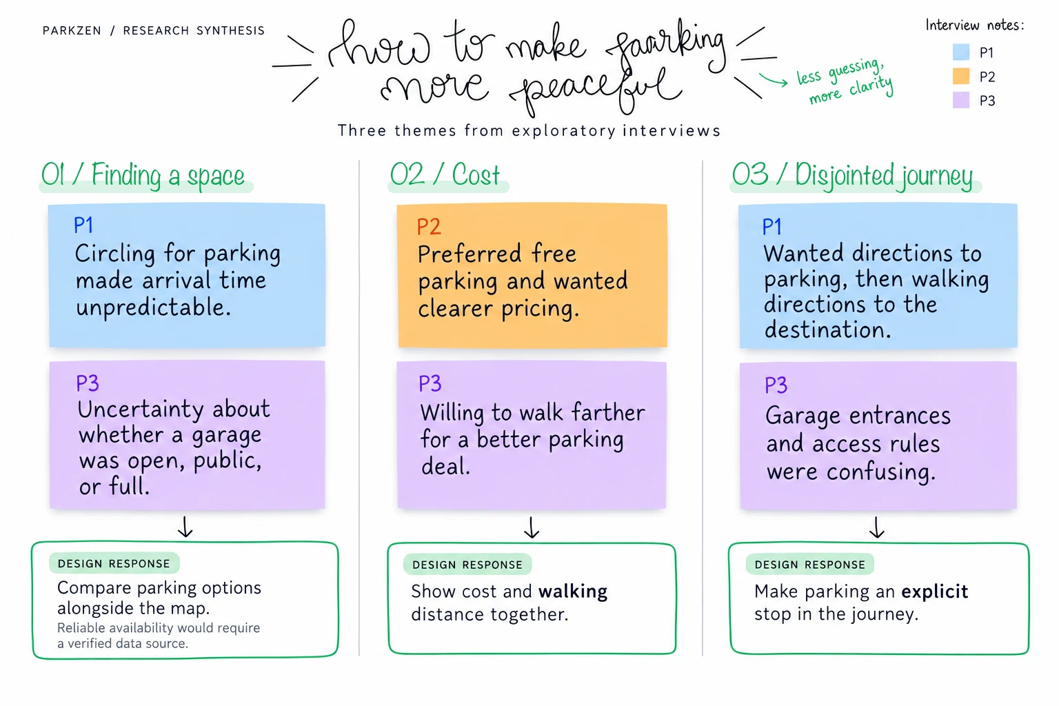
I reviewed local coverage, surveyed residents, and interviewed people about parking in Nashville. Three themes shaped the concept: availability, confusing information, and cost.
ParkZen
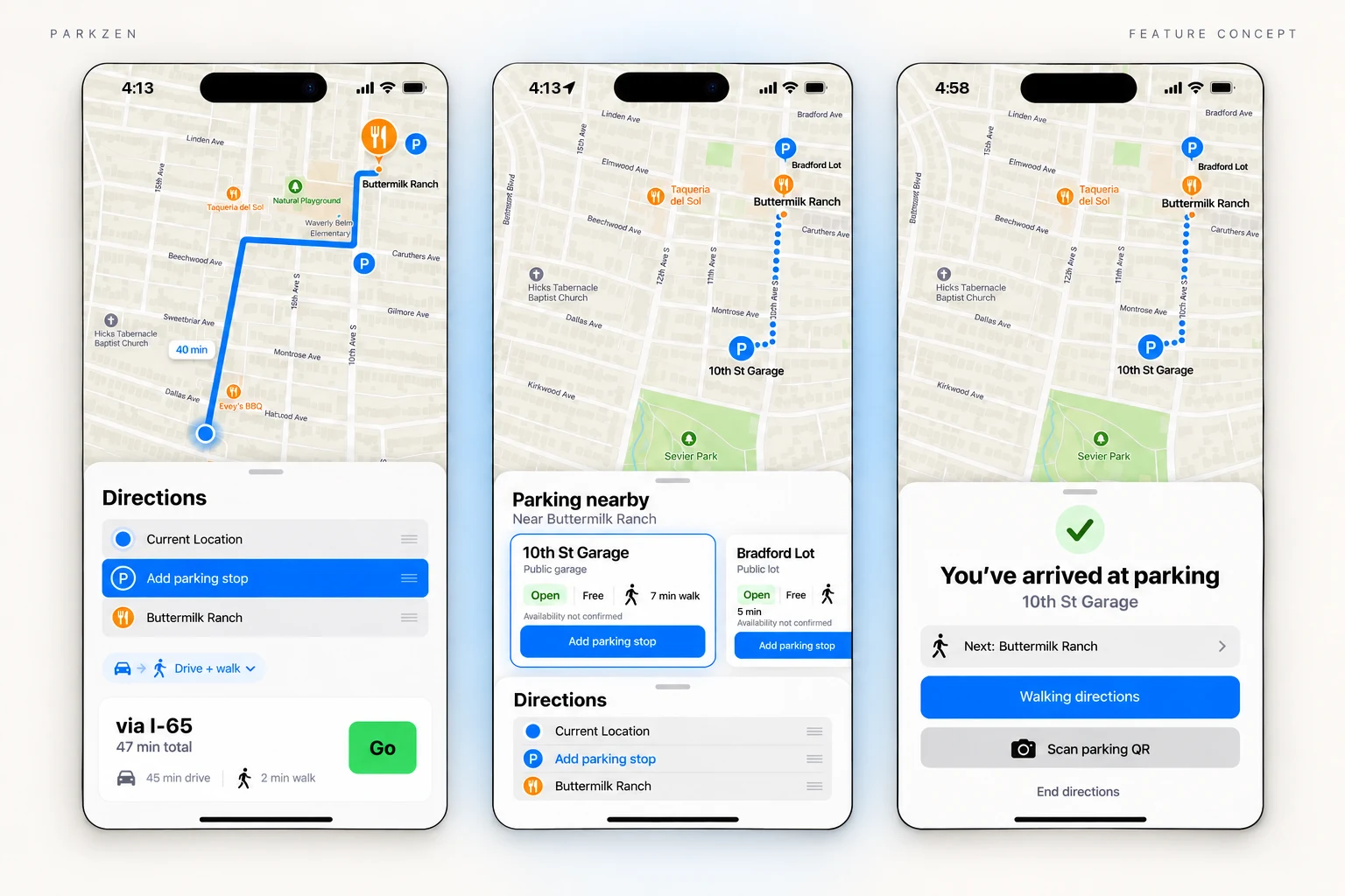
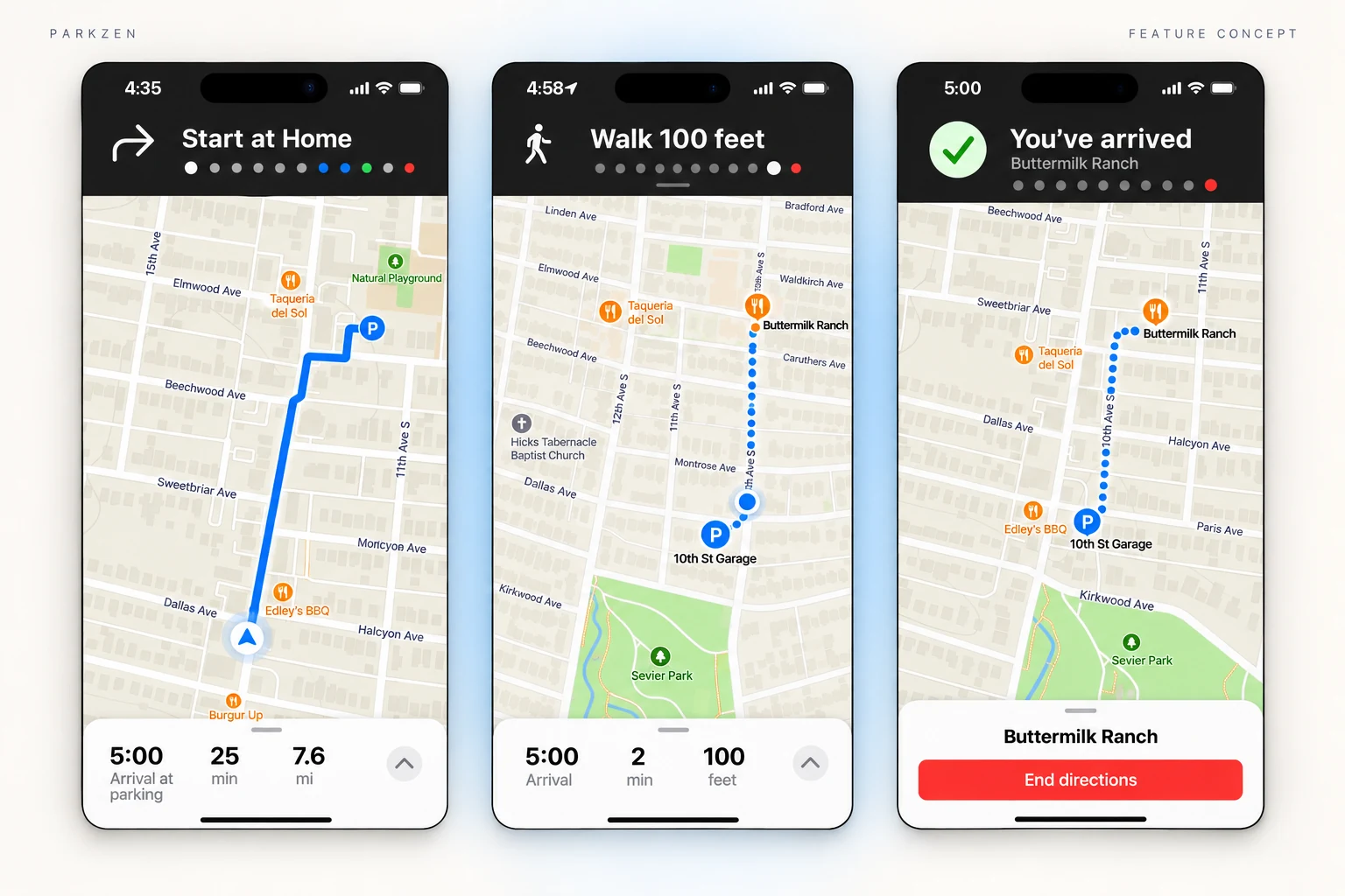
Research
One unexpected afternoon, my husband stumbled upon a hidden parking lot we’d never noticed. An El Dorado in the desert. The signage was misleading, the space was free, and the walk to Main Street took 30 seconds.
That serendipitous experience had us asking: how many parking gems are hiding in plain sight?
From that question, ParkZen was born: a concept feature for Apple Maps that makes parking discovery and planning feel clear, intuitive, and accessible.
Beyond my own experience
I reviewed local coverage, surveyed residents, and interviewed people about parking in Nashville. Three themes shaped the concept: availability, confusing information, and cost.
Strategy
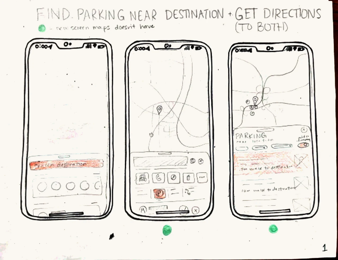
I explored how parking could fit into the navigation habits people already had. Sketching helped me work through the full sequence: find a destination, choose parking, drive there, then walk the remaining distance.
This is where I decided to build on Apple Maps instead of a whole new app, because of what I learned: people hate parking. The best way to make it better is to help it fade into the trip they’re already taking.
I studied Apple’s Human Interface Guidelines and Apple Maps’ typography, colors, bottom sheets, and navigation patterns, then used those conventions in my concept. The challenge was to make the new parking feature discoverable while keeping the surrounding experience familiar.
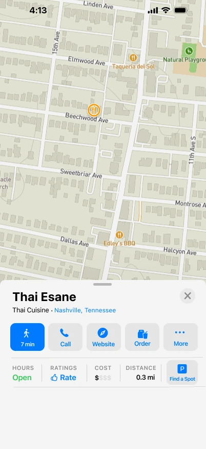
I also explored nearby search and payment flows. This case study focuses on selecting parking and completing the journey.
Test & refine
I moderated five think-aloud usability sessions: two in person and three remotely via Zoom, lasting approximately 20–30 minutes each.
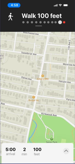
Participants compared parking near a restaurant and followed the journey from driving to parking through walking to their destination.
My participants were so helpful: their feedback changed the design in three ways.
01 / Make parking discoverable
“I didn’t notice Find a Spot.”
Usability participant
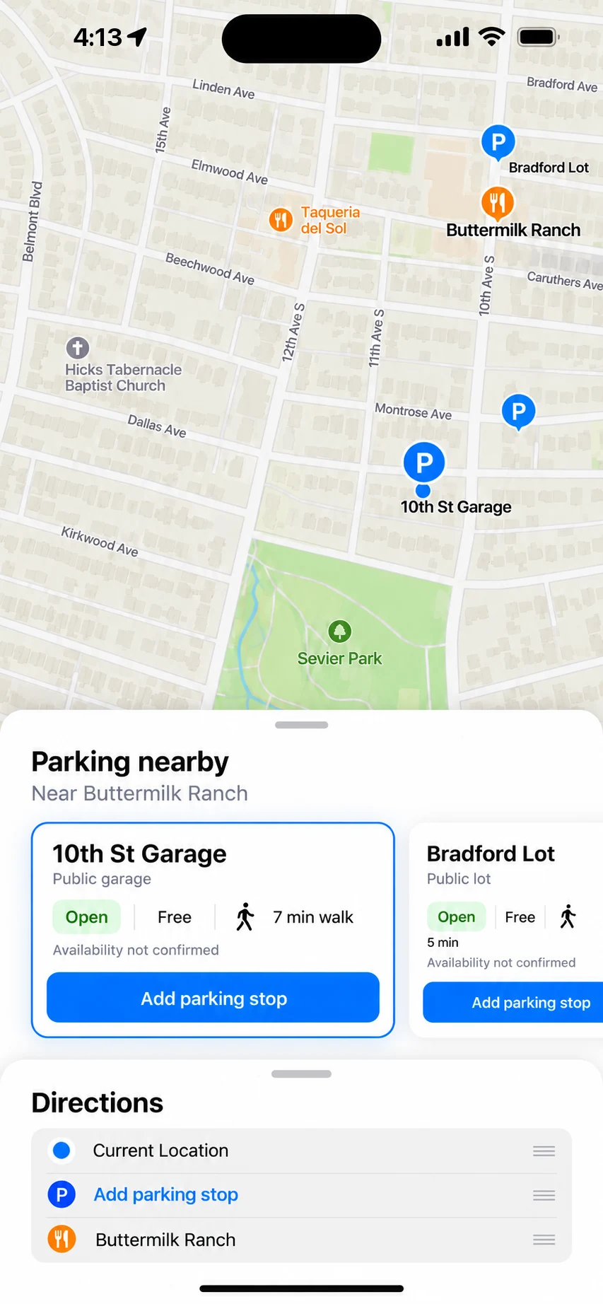
The separate action competed with the familiar blue directions button. I moved parking into route planning so it could become part of that existing decision.
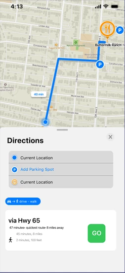
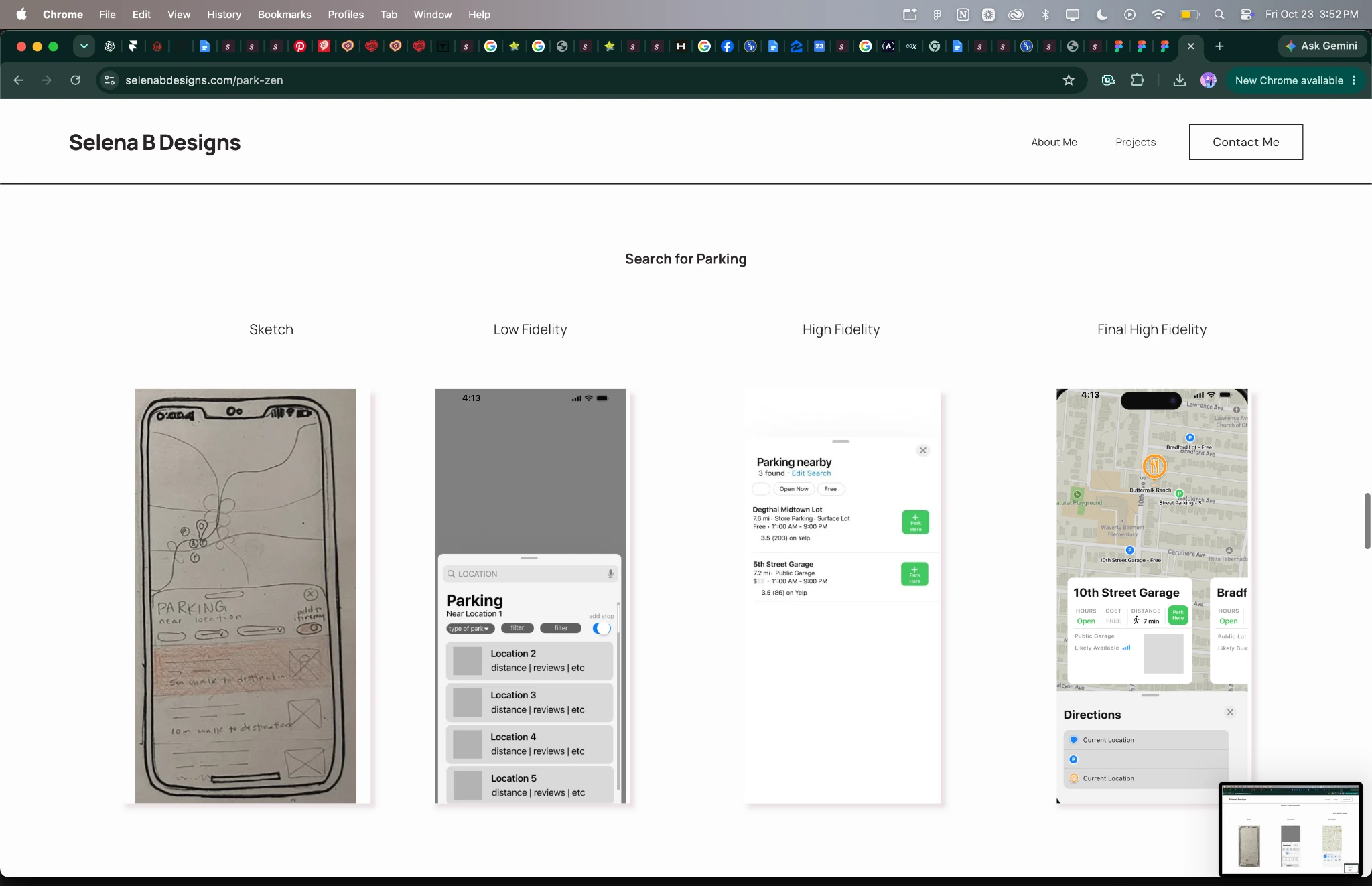
02 / Keep the map useful
A participant could not connect the parking choices to their locations on the map. I replaced the vertical results overlay with horizontal cards to leave more of the map visible during comparison, and tapping a card highlights its spot on the map.
03 / Clarify the handoff
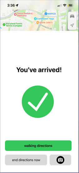
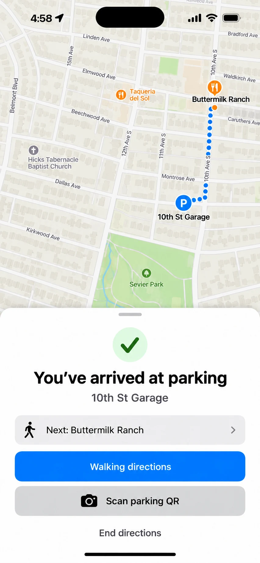
Another participant initially expected one set of directions. I made the parking stop explicit in the route and provided walking directions after arrival, carrying the journey through to the final destination.
Detail & reflection
Matching an established interface did not guarantee that people would notice a new action or understand a new sequence. I also reviewed contrast and refined the arrival screen’s text treatment.
“Designing ParkZen taught me how powerful small UX choices can be. Something as mundane as parking holds emotional weight: missed plans, unexpected costs, daily stress. I learned that clarity, timing, and flow matter as much as the visuals.”
Accessibility refinement
The earlier arrival screen placed white text on a bright green background. I changed the message to black text on white, retaining green as a success accent.
Contrast check · WCAG 2.2
AA requires 4.5 : 1 for body text and 3 : 1 for large text.
Visual refinement / Portfolio update
After growing as a designer, I revisited spacing, hierarchy, and labels. The camera action is now explicitly labeled “Scan parking QR” for parking-garage codes.
Next test
Next, I’d implement the design and test whether people find the parking step, connect each card to its location, and move smoothly from driving to walking.
Implementation question
Availability and pricing would need dependable data sources. Recommendations from other drivers could help fill the gaps. An implemented experience would also require platform feasibility work beyond this prototype.
An independent concept; not affiliated with Apple.