Brand, UX & development Project management Client communication
Tools
Figma WordPress / Elementor HTML, CSS & JavaScript Make (automation) ChatGPT & Claude (code assistance)
Timeline
14 weeks / 2026
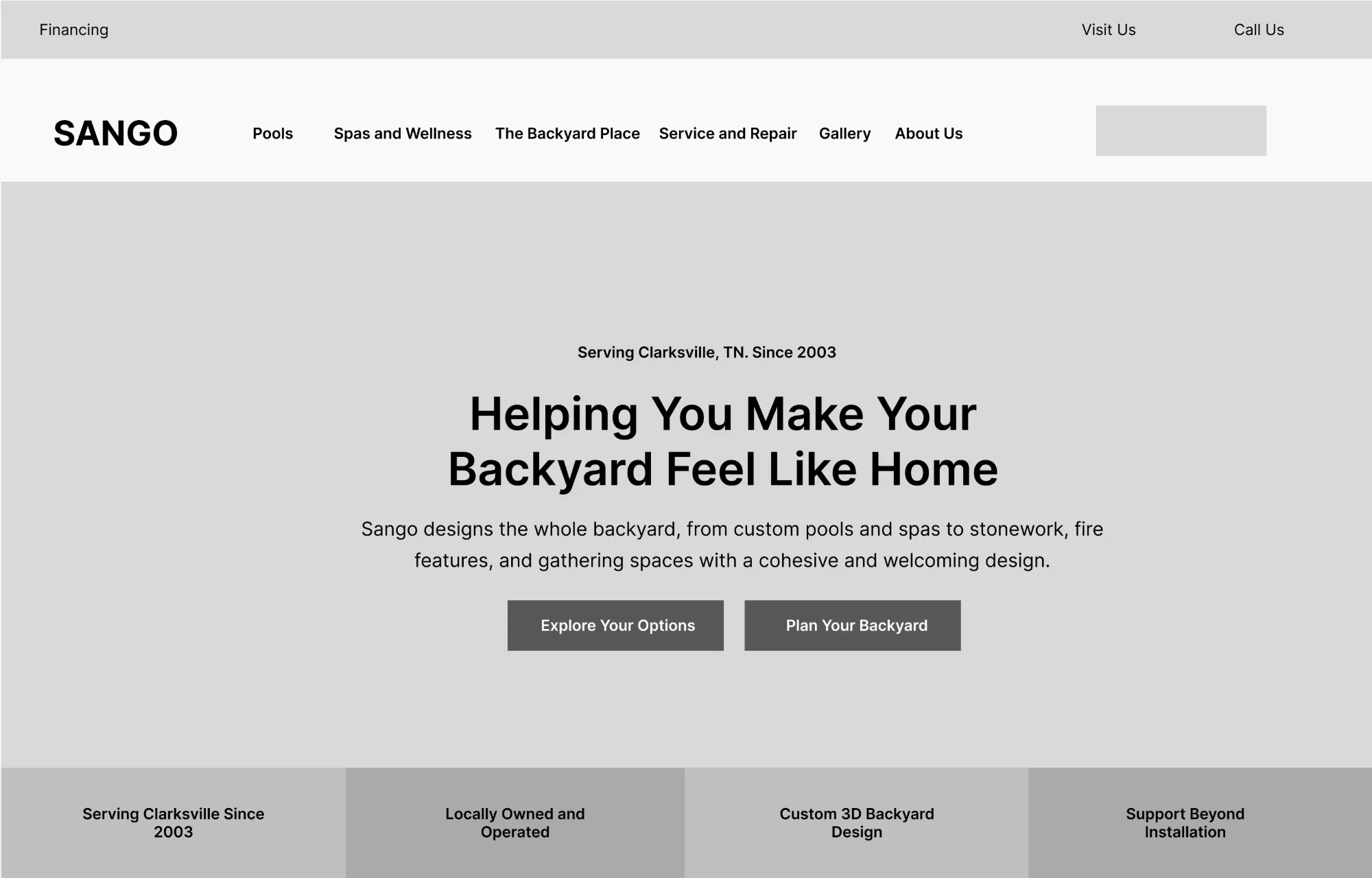
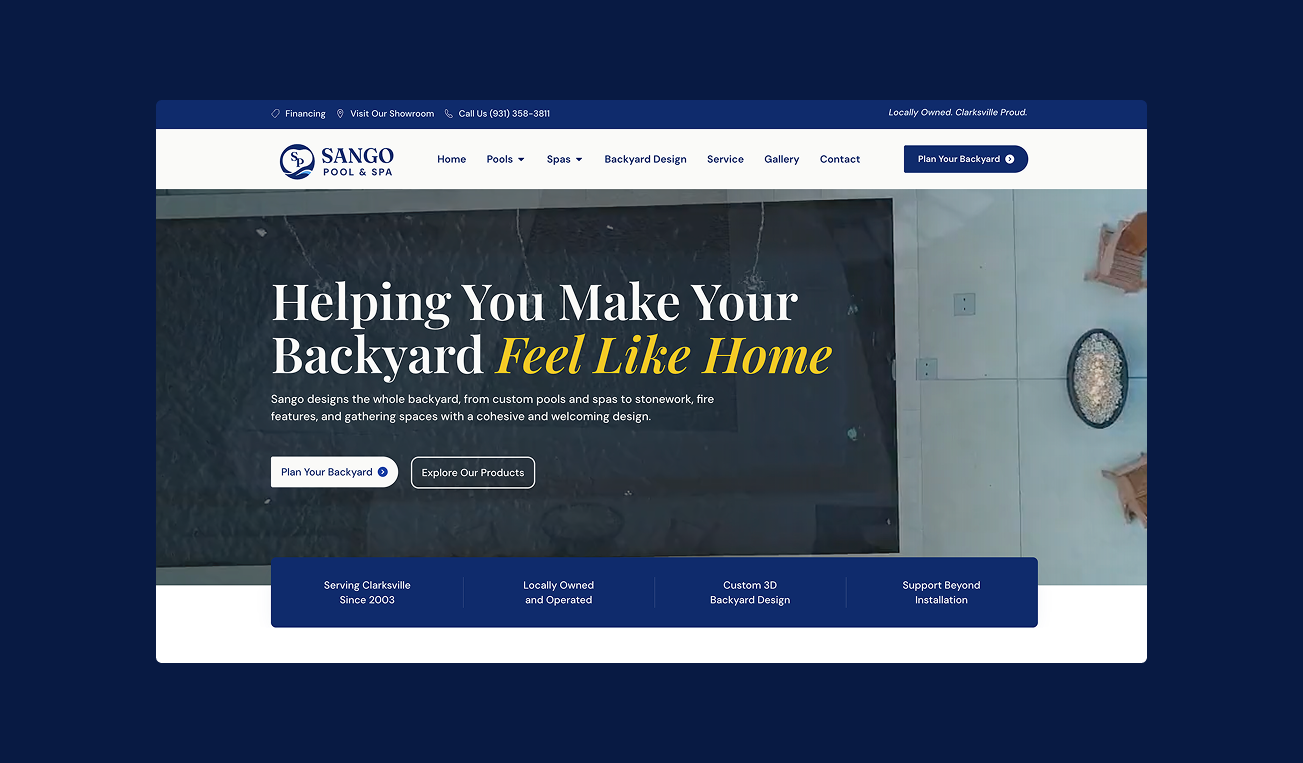
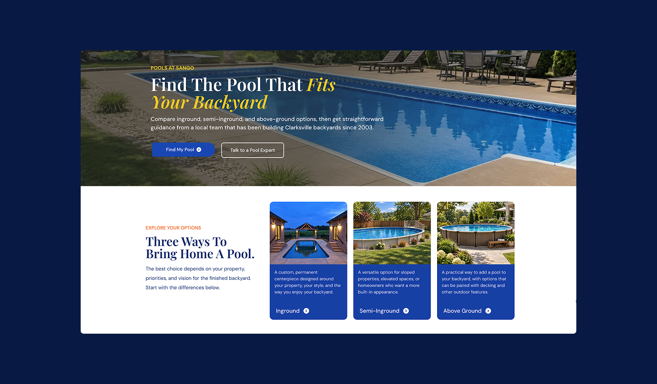
01 Home hero. All user types.02 User split pathway for 3 distinct customers.03 Visual aid for the value of 3D design.
Behind the workExplore the design processBrand decisions, product journeys, custom code, and launch.
01
Brand
Premium, without feeling exclusive.
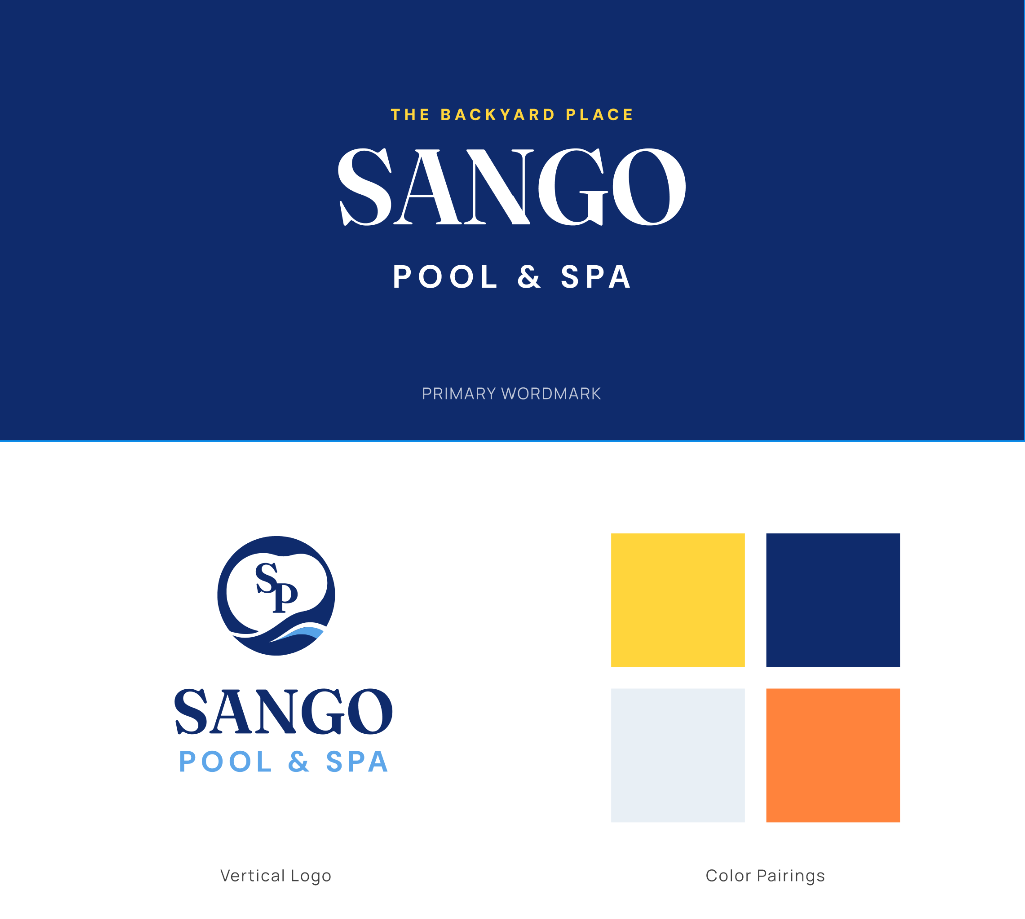
Sango needed to appeal to first-time pool buyers and customers planning high-end backyards. I used deep navy, serif typography, and generous space for a more refined identity, with yellow and orange keeping it warm.
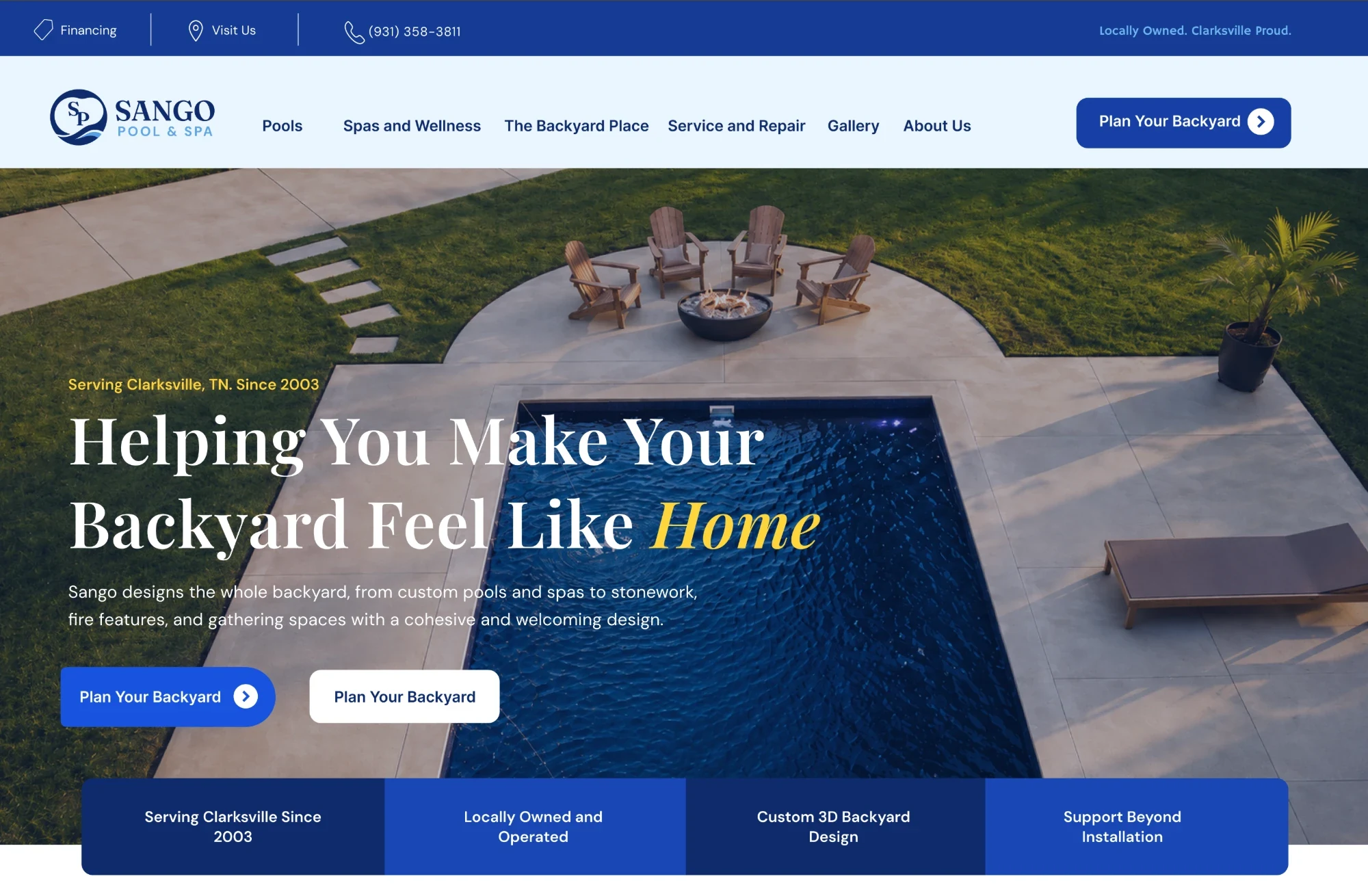
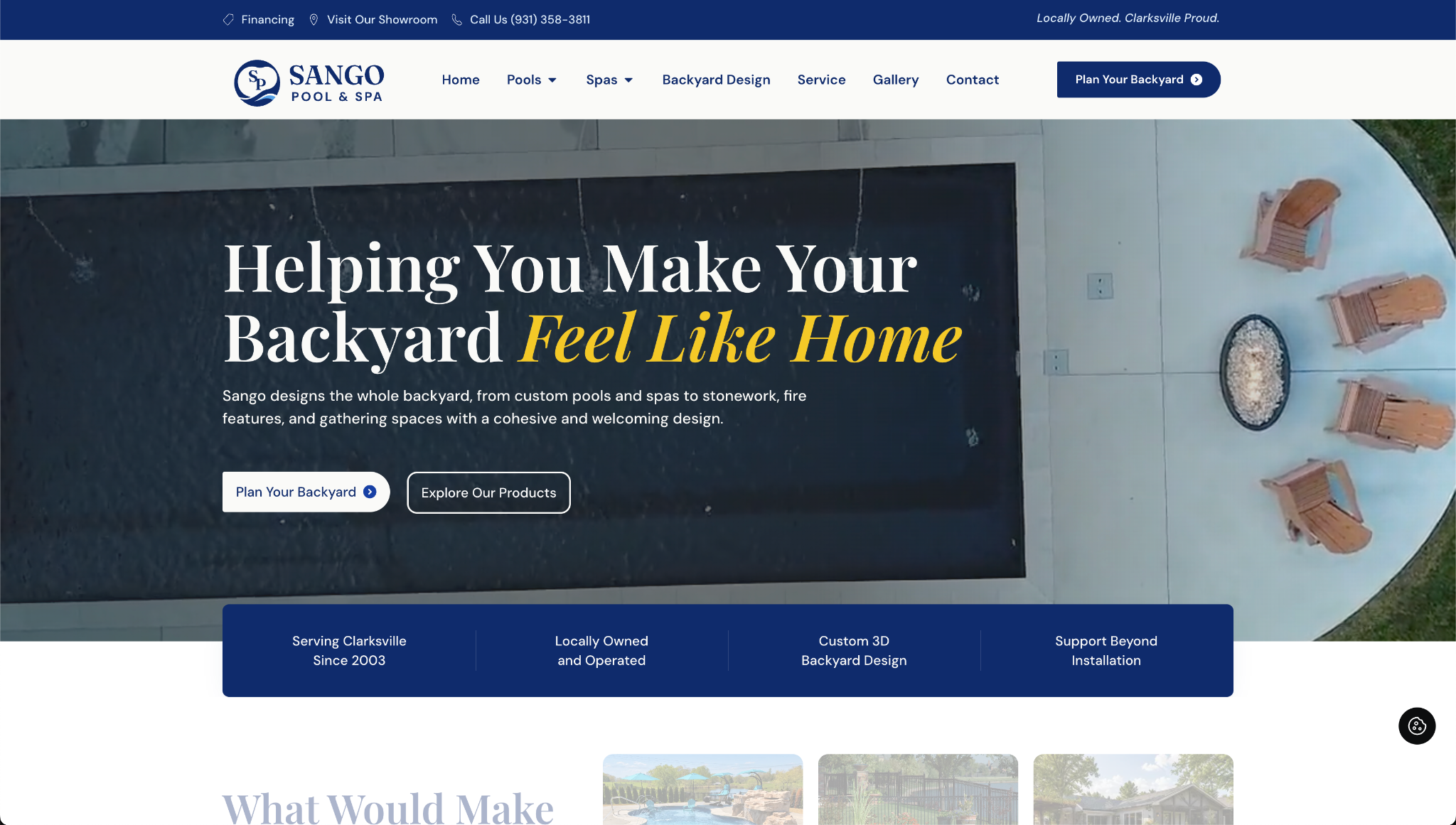
An early version used blue photo overlays. Feedback from operations and ad strategy found it overwhelming, so I changed them to charcoal to give the brand more breathing room. I also moved the palette from a bright blue to a heritage blue.
01 Building Sango’s identity
I reviewed pool and outdoor-living brands to understand the category’s visual language. Blue, white, and warm accents felt familiar, but Sango needed an identity that could support both family pools and high-end backyard projects. My goal: balance the approachability of The Pool Factory with the premium feel of Waterscapes.
Logos shown for reference only; each identity belongs to its owner.
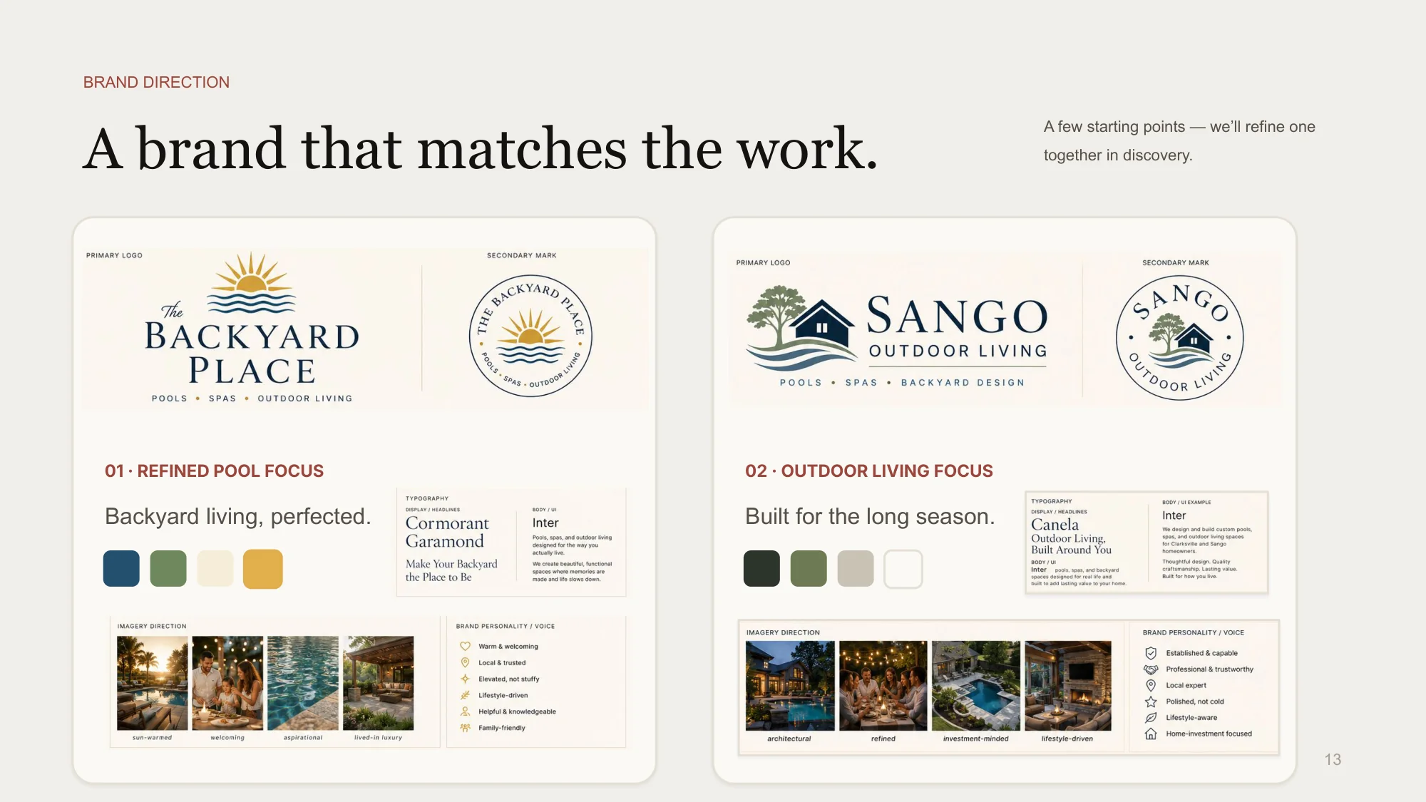
From my pitch deck: two starting directions, mocked up quickly with AI as a conversation starter about what the client liked and didn’t. I paired them with Pinterest mood boards in discovery.
02 Heritage blue, warmed with sunshine.
Deep navyGolden yellow
A grounded foundation
Deep navy gives the identity a more established feel. Golden yellow adds warmth and the sense of a family summer outdoors.
Pale blueOrange
A lighter counterpoint
Pale blue gives detailed product content space to breathe. Orange adds energy without making every part of the brand compete for attention. Warm accent, accessible contrast.
03 Brand guide
Serif typography, restrained color pairings, and generous space make the range feel connected. Warm accents keep the identity approachable. I gave the client three logo variations, detailed typography guidelines, a color palette checked for accessibility, and photography direction.
The final identity combines a heritage-inspired foundation with warmer, more playful accents.
02
Website
From wireframes to the finished website.
I wireframe first to make sure the UX works before color and typography come in. Each stage below answers a different question: where people go, how it feels, and what finally ships.
Who the site had to serve
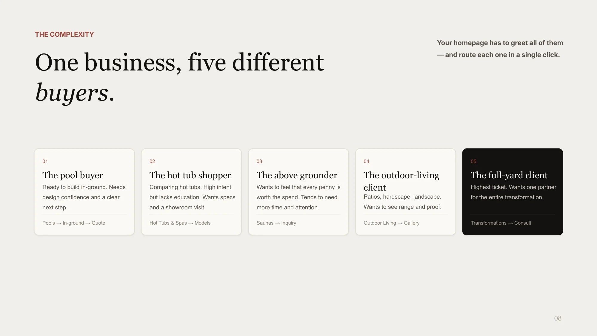
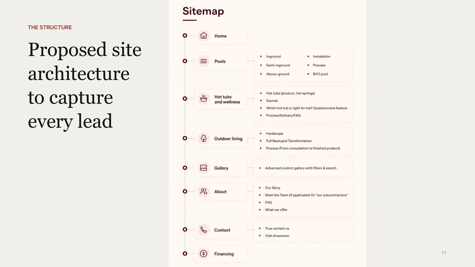
I mapped five distinct buyers and gave each one a route from the homepage, then built the site architecture around those paths.
Five buyer types from my research, each with a route through the site.The proposed site architecture.
01 · Establish the layoutSet the hierarchy and routes into pools, spas, and backyard services before applying the brand, based on the researched user types.
02 · Apply the identityExplore the navy palette, typography, and photography together. A multimedia designer assisted at this stage. Internal feedback flagged the blue overlays as overwhelming.
03 · Refine the toneCharcoal overlays reduce the blue. The headline shifts from a resort-style promise to the more personal idea of feeling at home.
Campaign concepts · Built landing pages
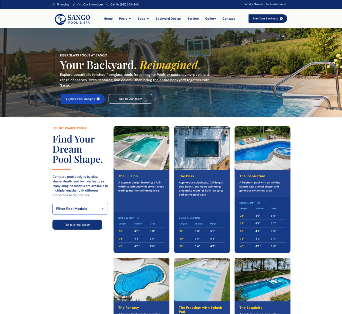
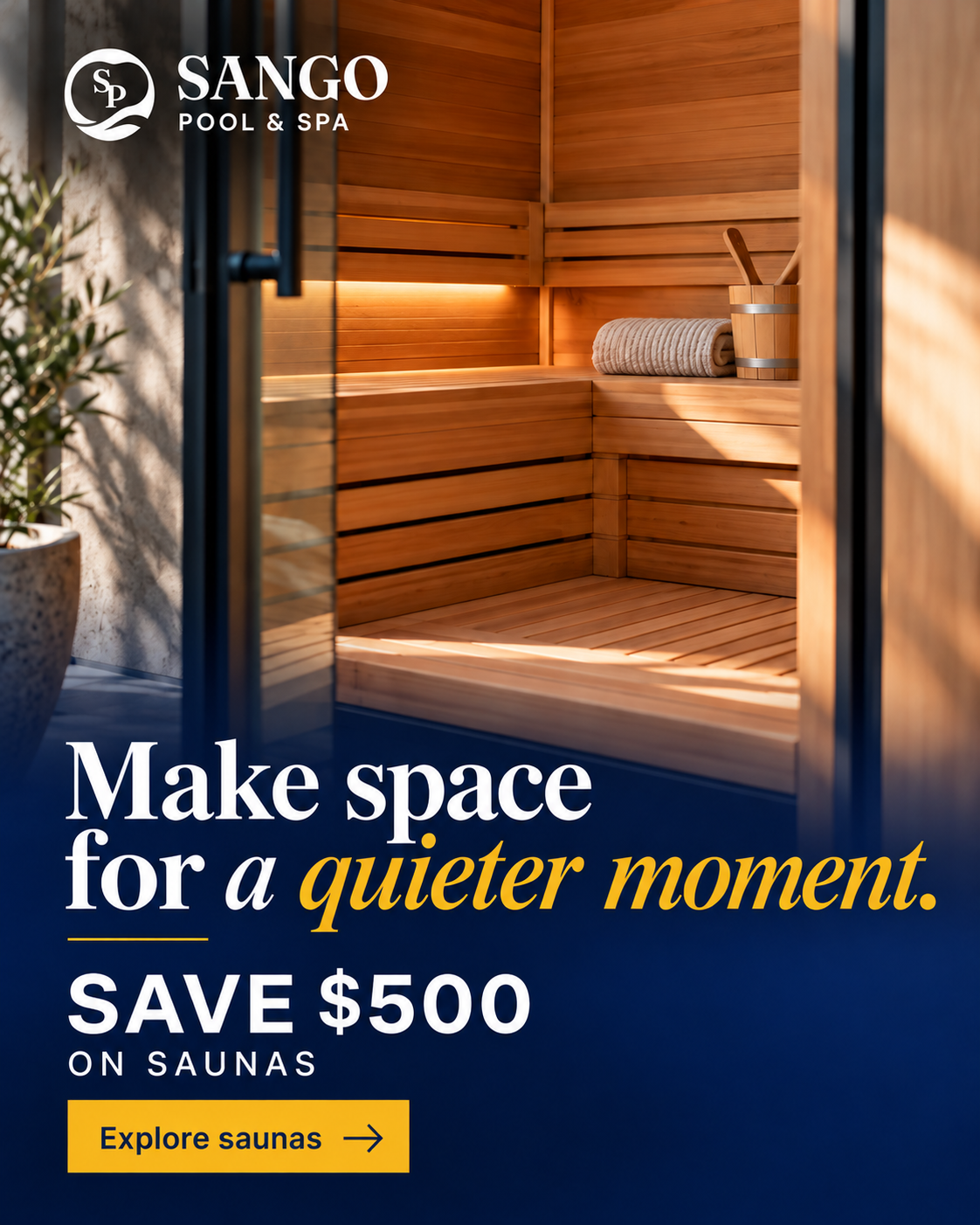
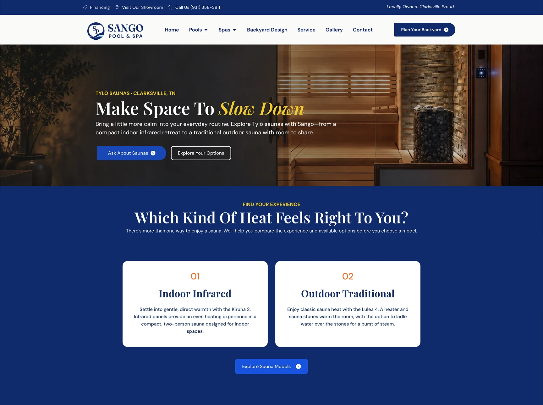
A product-specific path from ad to inquiry.
One of my favorite parts: I worked with the ad team from UX and branding onward, so every landing page was built for the ad traffic it would receive.
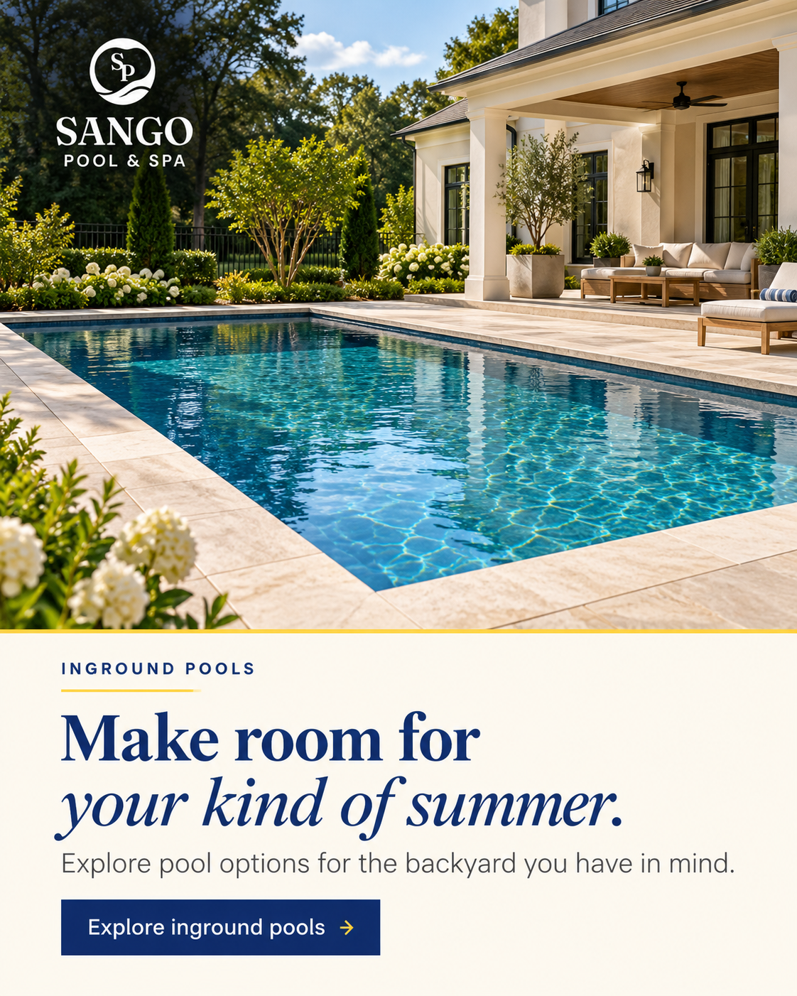
Inground pools
01 Ad concept
02 Landing page
Saunas
01 Ad concept
02 Landing page
03
Development
A filterable catalog for nine swim spas.
A late product-lineup change expanded two swim spas into nine across three series. I replaced large comparison cards with a custom explorer so visitors could narrow the range by series and separate swim and hot-tub zones, then open the specifications they needed.
HTML data attributes connect each model to the filters. On mobile, specifications stay collapsed until requested.
The filters in use.
I built the explorer with HTML, CSS, and JavaScript inside Elementor, using AI tools to help implement and debug it.
See the code
Make the current selection clear.
The pressed state tells visitors which series is selected, including people using assistive technology. The same selection drives the product update.
series = button.dataset.series;
update();

button.setAttribute(
  'aria-pressed',
  String(button.dataset.series === series)
);
Keep the product data separate from the layout.
Data attributes identify each series. The same matching rule can show one series or reset to all models without a separate page for each view.
series === 'all' ||
group.dataset.group === series
Avoid empty sections.
After filtering, a series heading should only remain if it has matching models beneath it. Hiding empty groups keeps the results easier to scan.
A result count gives visitors a quick check on the current view, especially when a filter changes how many models appear.
count.textContent = visible === cards.length
  ? `Showing all ${cards.length} models`
  : `Showing ${visible} of ${cards.length} models`;
Let people narrow the same results in two ways.
A model must match the selected series and, when checked, have separate swim and hot-tub zones. Keeping both conditions in one rule makes the filters work together.
Live website recording. Choose a filter above to jump to it and see its code.
04
Launch
Launch & handoff.
I launched the site in October 2026, ready for Sango’s ad campaigns: every product line has its own path from ad to inquiry, and every inquiry reaches the right person. Twenty-three years of reputation finally show up online.
A clear route from interest to inquiry.
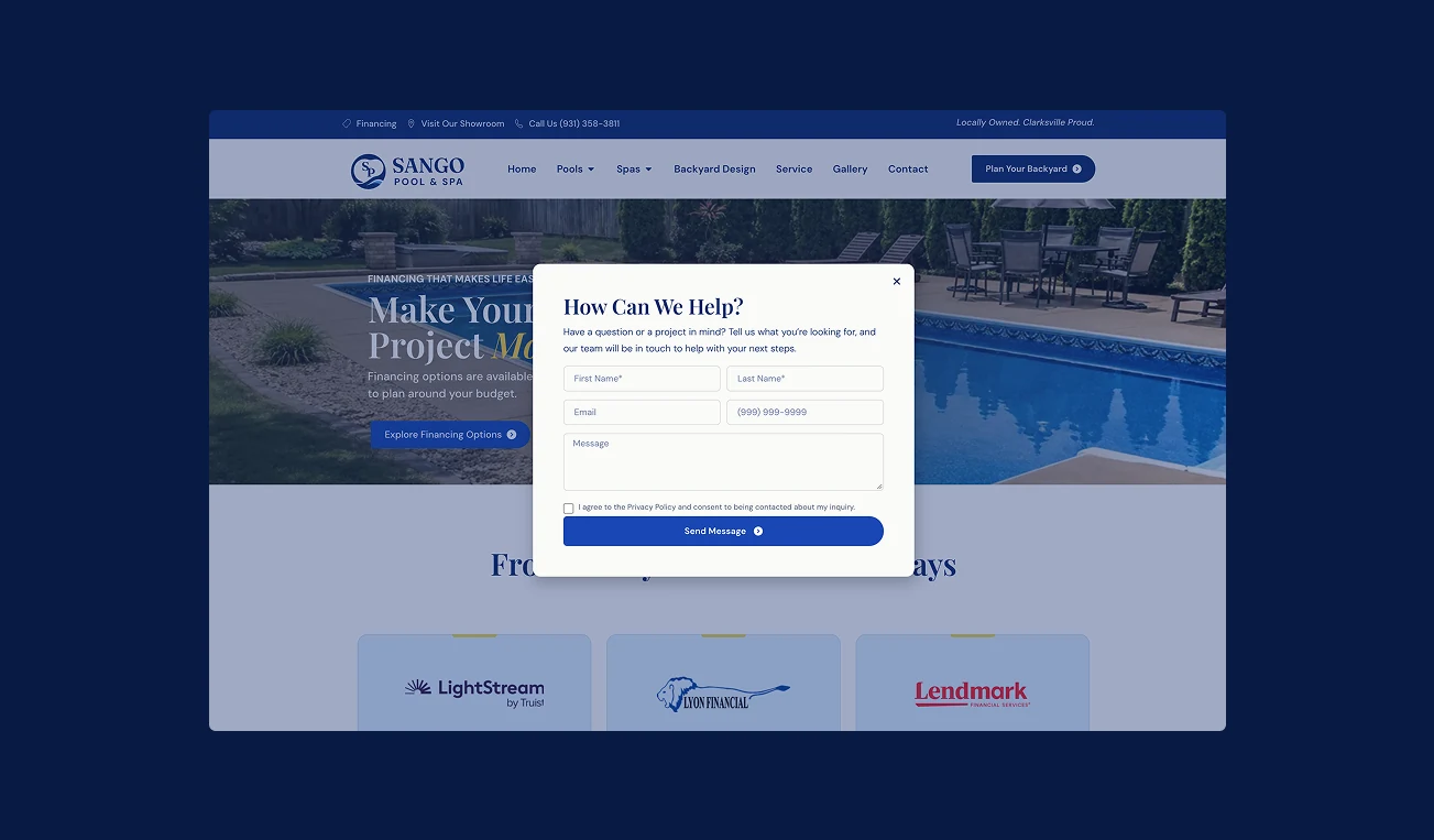
Forms & inquiries
Sango didn’t have the budget for a forms plugin, so I built a webhook automation in Make that sends every Elementor form submission straight into a shared Google Sheet. Anyone on their team can see new inquiries live, without logging into WordPress.
Tracking & SEO
I configured and tested tracking and analytics with operations’ sign-off, and set up page metadata and on-page SEO.
Launch & handoff
With launch checks complete, I took the site live in October 2026 and handed it off to the client.
 Local referenceAR Pools · Stoneworks & Outdoor LivingSee site (opens in a new tab)
 Industry referencePool & Spa DepotSee site (opens in a new tab)
 Industry referenceThe Pool FactorySee site (opens in a new tab)